


01 / THE ICONIC
Background —
My role
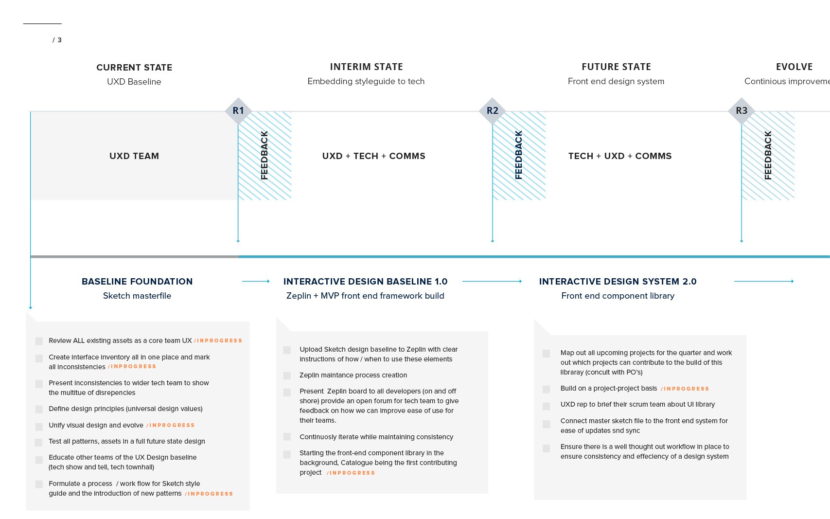
researchvisual designdesign auditdesign leadinternal testingThe problem
Because the design team worked in cross functional squads, basic fundamental elements such as spacing, icons, font and colours varied from feature to feature, this created an inconsistent experience for our users. It also took a full squad to create a simple page or feature as there was so no reusable components in the site.
 The challenge
The wider company didn’t see the value in a dedicated squad to the design, develop and manage this mountain of a project we called THE ICONIC Design System.


The key idea behind this methodology is small, independent, atomic-parts that can be combined into larger molecular structures.
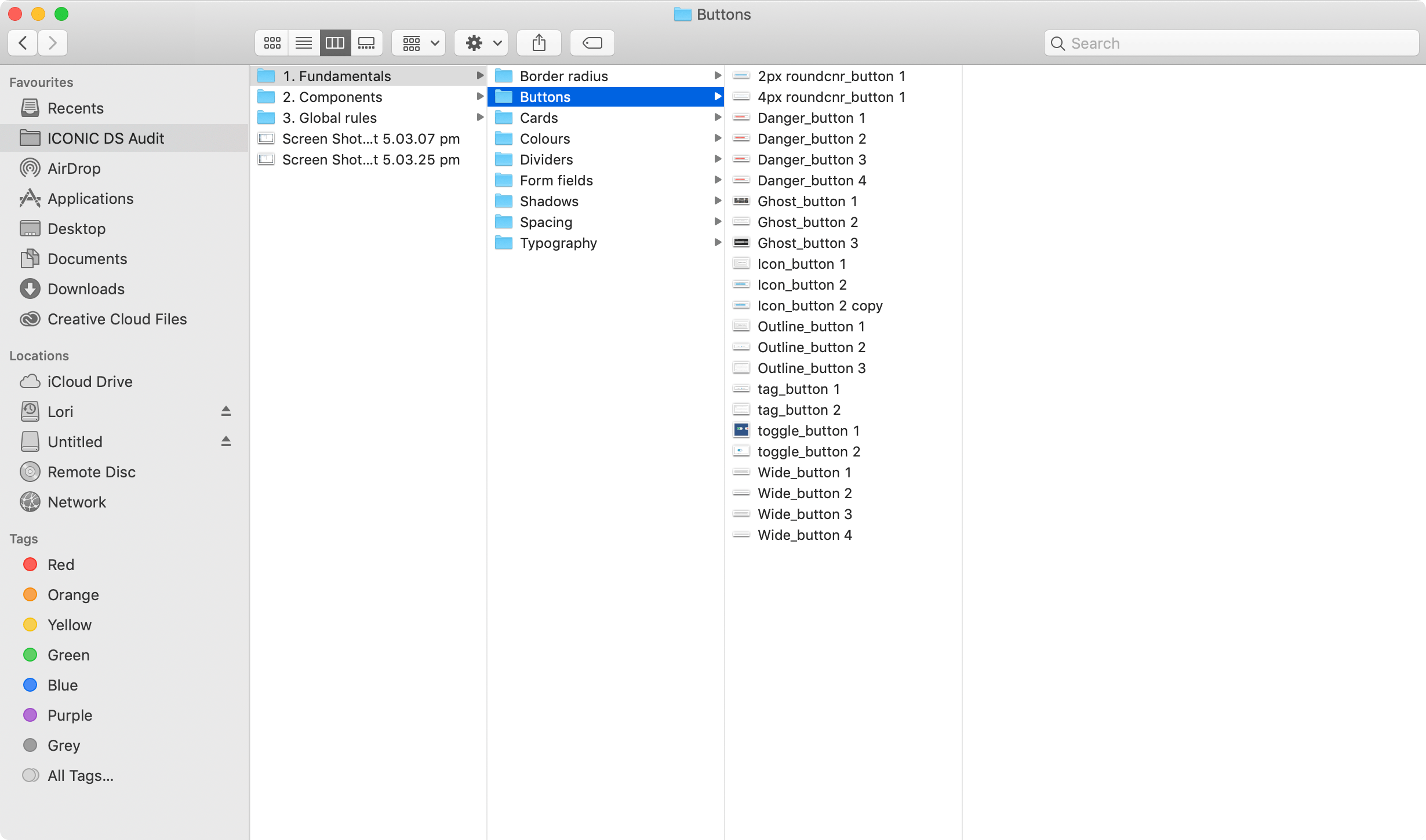
This foundation defined our grids, spacing, typography, dividers, border radius, shadows, buttons and form fields.
The 8px grid has been chosen due to it’s flexibility to a variety of different screen sizes. In some cases, a smaller increment is needed hence the use of 4px. This should be limited to use in text and icon placement.
Using this guide for both horizontal and vertical spacing will ensure consistency across all devices and mediums. This enables rapid and consistent scalability across THE ICONIC.

We use Proxima nova as the main typeface across web and app with Didot as the secondary font mainly used for marketing campaigns.

The Primary colour palette was used throughout the site and we also had a colour palette exclusively used for illustrations and some iconography.
Primary colours

Illustration colours

Cards are a great way to isolate content from its surroundings, indicating interactivity and denoting hierarchy. Cards of both types always maintain a 4px radius with ‘smooth corners’ applied.


Buttons allow users to take action in one click. Here are all the buttons we use and why.
Primary

Secondary

Ghost CTA

Labels

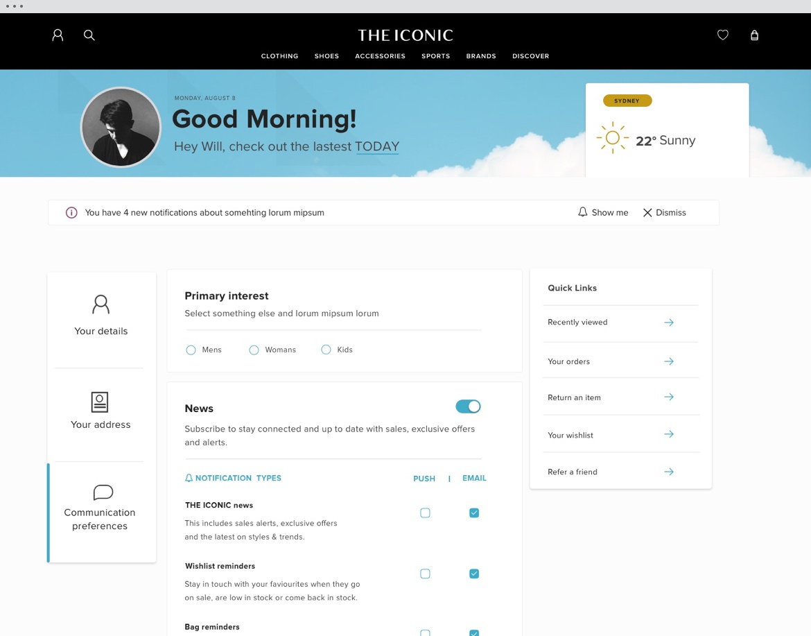
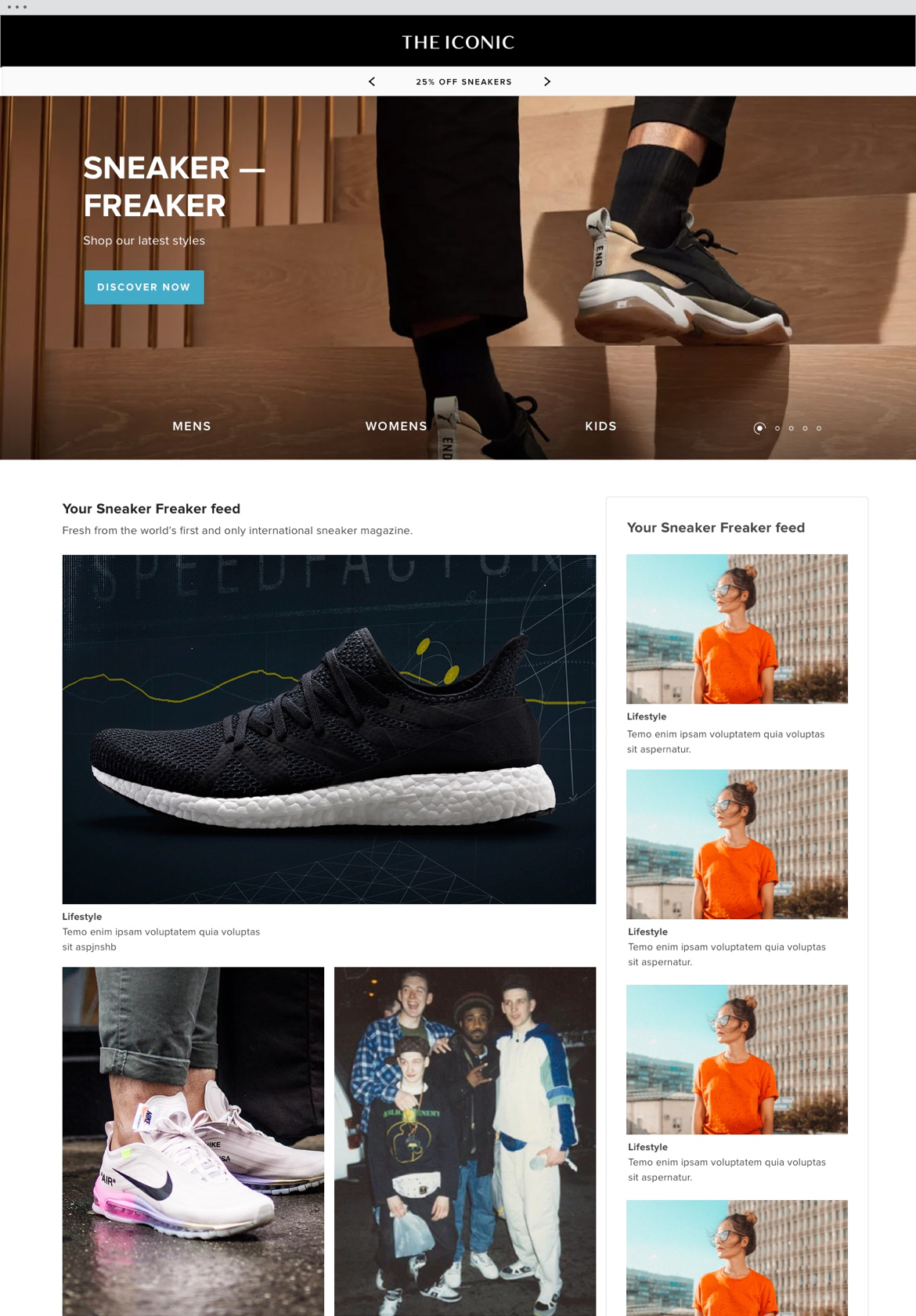
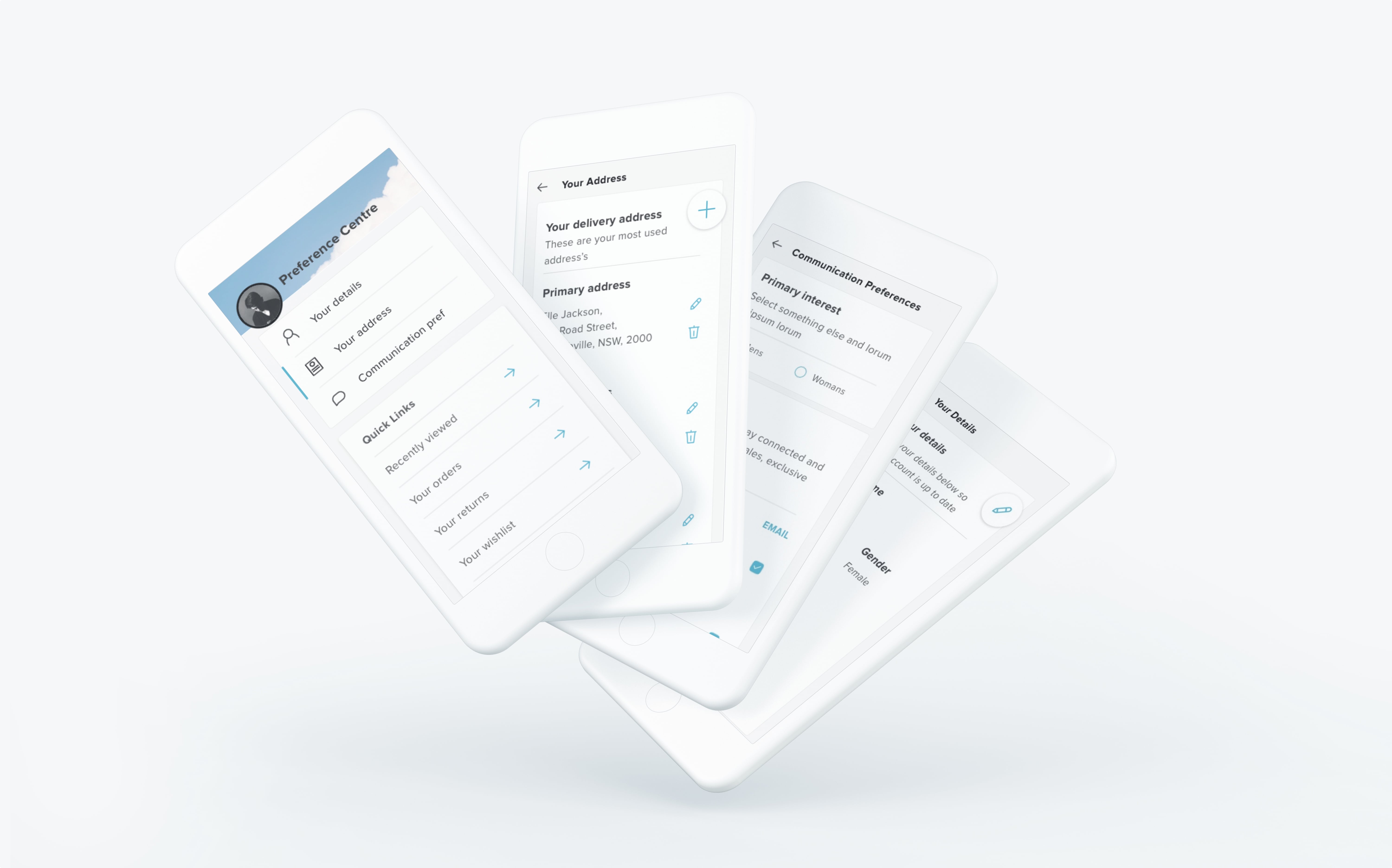
12hrs → 45mins 
The preference centre I worked on was designed in 1 day due to using reusable components. A feature like the preference centre would usually take around 2 weeks of design time for desktop alone.
We also designed the ‘Sneaker Freaker’ campaign in 45 mins using the new design system which would normally take 12 hours.
Design System result
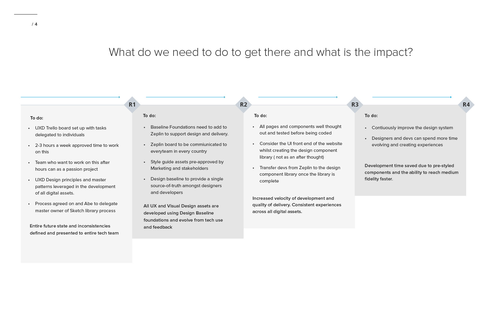
 Bringing it all together
After 3 months tirelessly working towards the creation of THE ICONIC Design System, the wider company saw value in this project and decided to dedicate a full time design squad.
Now, not only is the design reusable but the same can be said for code, reducing costs and creating major efficiencies across development. The next step is for a front-end public accessible website to be built explaining who were are, how we look, as well as our principles using atomic design methodology.

If you want to discuss a project, have a chat about typography or are just interested in hiring me please…


